
By Elias Luiz
Brazil created a visual identity for its trails, but adopted a marking system more complex than necessary. While countries with thousands of kilometres of marked trails and decades of accumulated experience favour simplicity, the Brazilian Trails Network made a sense of belonging and commercial potential part of the criteria for choosing a symbol whose primary purpose should be to guide hikers.
After hiking thousands of kilometres on long-distance trails in different countries, I learned that good trail marking must meet four fundamental principles: simplicity, legibility, durability and ease of maintenance. In Switzerland, I hiked hundreds of kilometres along the Via Alpina, following the traditional white-red-white stripes, similar to those I encountered on trails in Bavaria, Germany. In Sweden, I crossed the Kungsleden, following red marks painted on rocks and trees. In Canada, I hiked the Great Divide Trail, where so-called blazes, simple geometric marks, guide hikers even in remote regions where maintenance presents an enormous challenge.
This experience led me to question the model adopted by the Brazilian Trails Network, particularly after reading the article “Os caminhos que levaram à padronização da sinalização na Rede Brasileira de Trilhas”, published in April 2021 by Pedro da Cunha e Menezes and José Carlos Sícole Seoane, and watching the video “Sinalização rústica: Como usar as pegadas amarelas e pretas para sinalizar as Trilhas Brasileiras”, in which Pedro explains the origins of the Brazilian model. Both sources show that the decision to use yellow and black footprints was not based solely on technical wayfinding criteria, but also on the intention to create a visual identity that would foster a sense of belonging and encourage the sale of tourism-related products.
This reflection is also echoed in the dozens of messages I receive and in conversations with people involved in the adventure community. Many share criticisms of different aspects of our field, yet few are willing to speak out publicly. Among them are influential figures who prefer to remain silent because they believe nothing will change, fear exposing themselves or simply regard certain problems as part of our culture. I respect that choice, but I see things differently. If we have the experience to identify what does not work, we must also be willing to question it and help improve things.
The mistake began before the footprints
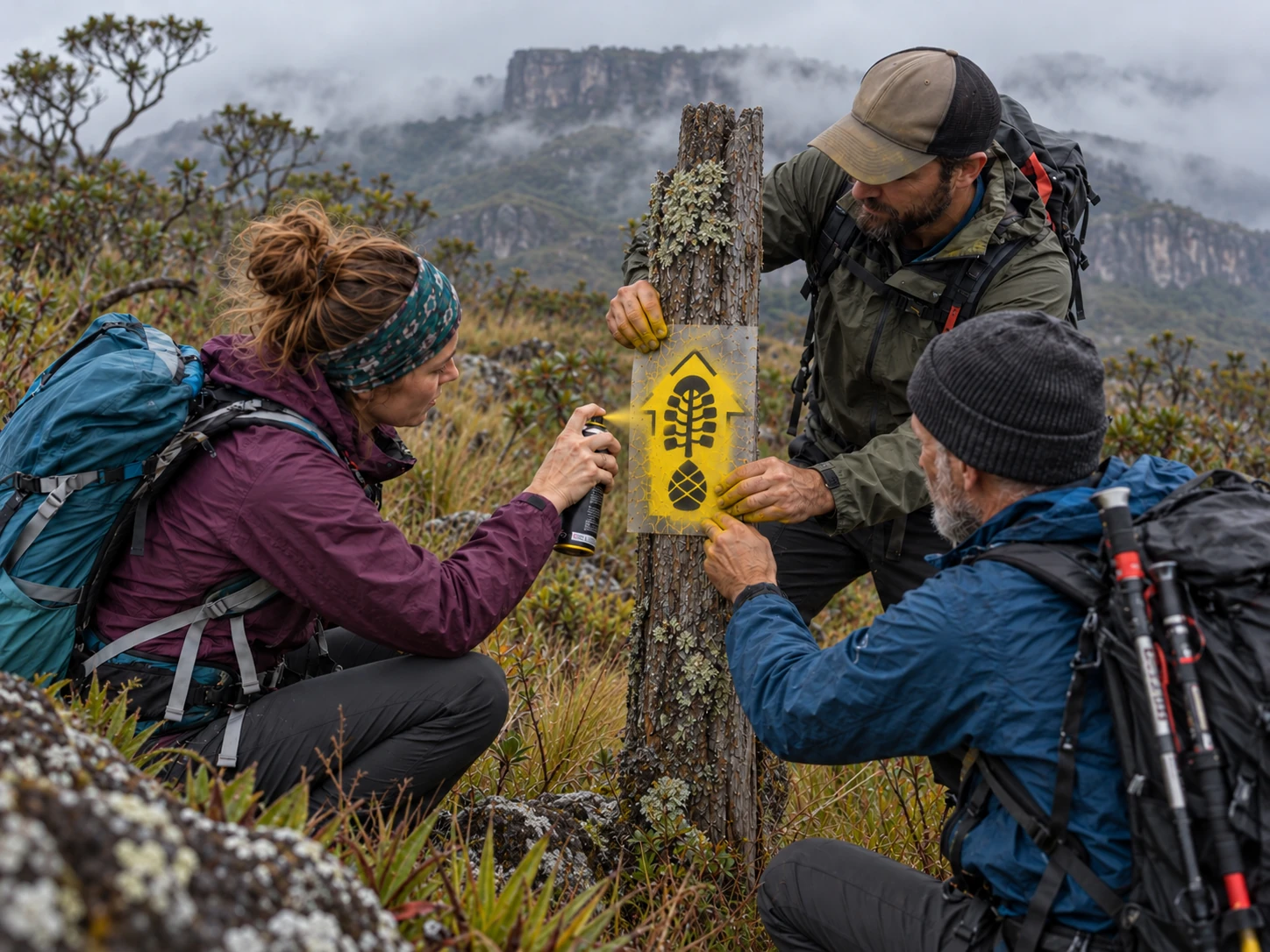
The history of Brazilian trail marking was influenced by the United States. During technical visits there, those responsible for the project learned about the system used on the Appalachian Trail, based on white rectangles painted on trees and other surfaces. According to Pedro da Cunha e Menezes, the Americans themselves recommended that Brazil not replicate that model, considering it insufficiently intuitive for a trail network. The solution chosen was to use arrows, regarded as universal and easily understood by any hiker regardless of language.
In my view, the first mistake began with precisely that choice. Yellow arrows are widely associated with the Camino de Santiago, a historic pilgrimage route crossing cities, villages and rural areas. Although long-distance hikers also follow it, its tradition and characteristics differ from those of major mountain traverses. Europe has had other well-established trail-marking systems for decades, based on coloured stripes and simple geometric symbols, which I encountered firsthand on trails in Switzerland and Bavaria.

What struck me most was the explanation Pedro da Cunha e Menezes gave in the Brazilian Trails Network video. When discussing the technical visits to Europe, Pedro says that Europeans recommended abandoning arrows, not because of wayfinding or maintenance problems, but because they did not inspire a sense of belonging and could not be turned into commercial products. In his own words:
“Yes, but an arrow doesn't create a sense of belonging. People don't fall in love with an arrow, and it doesn't become a product either. It doesn't become a T-shirt, a key ring or a sticker.”
Pedro da Cunha e Menezes
The statement is revealing. In that part of the presentation, the traditional coloured-stripe systems used on European mountain trails do not enter the discussion. This does not mean the project leaders were unaware of them, but it is striking that systems established over decades across thousands of kilometres of trails are absent from that explanation. Why not prioritise a technical comparison of effectiveness, durability and ease of maintenance before looking for a new visual identity?
The commercial argument is also recorded in the article published by the Brazilian Trails Network itself in 2021. The authors acknowledge that arrows correctly showed the way but did not generate a sense of belonging or lend themselves to saleable products. The article goes further, advocating different regional logos as a way to encourage the purchase of additional products during a traverse. By that reasoning, a hiker could buy new T-shirts, stickers and souvenirs when passing through trails with distinct identities.
This is precisely where I believe the central design mistake of the Brazilian system occurred. Trail markers should not be chosen for their ability to sell T-shirts, caps or souvenirs, but for how effectively they guide people and how easily they can be reproduced and maintained. Nothing prevents a trail from developing products, generating income or having its own visual identity. The problem is confusing a trail's logo with the waymarks that need to guide hikers.
When visual identity gets in the way of navigation
Just look at the collection of Brazilian footprints to see how much information is packed into a single symbol. In many cases, the mark tries to represent three elements at once: an arrow, a footprint and, inside that footprint, a regional illustration featuring animals, plants, monuments or other images. The result is a visually crowded composition, with competing details that make it harder to read at a glance.
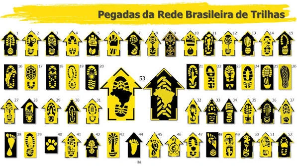
The problem grows when the arrow needs to be placed horizontally to indicate a change of direction. At that point, the footprint and its internal illustration are also turned sideways, losing some of their legibility. A design that works on a T-shirt or sticker does not necessarily work when painted on a tree trunk several metres away in rain, fog or low light.
For trail marking, the priority must be immediate navigation. A hiker should not have to interpret an elaborate graphic composition to recognise the route. The simpler the symbol, the easier it is to identify, reproduce and restore.

Visual identity: the American model is far ahead
When we compare the visual identities of Brazilian and American trails, the difference is obvious. The United States has developed a family of emblems for its national trails, with similar shapes, balanced proportions and room for each route to represent its own history. The Appalachian Trail, Pacific Crest Trail, Continental Divide Trail, Oregon Trail and many other routes have distinct symbols while retaining a shared graphic language. In my assessment, the result is far more professional, clean and organised than the collection of Brazilian footprints.
And this standard is not limited to a single trail. The National Trails System brings together different categories of routes, each with its own identity within a recognisable institutional framework. Other countries have also developed visual identity systems for their routes, demonstrating that a national brand can exist without requiring every regional design to become the main mark painted along the trail.
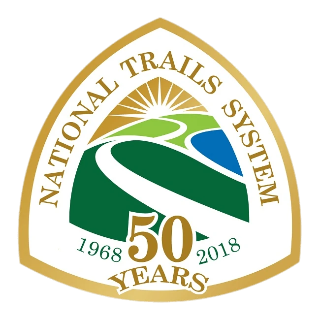
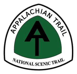
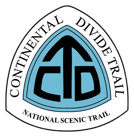
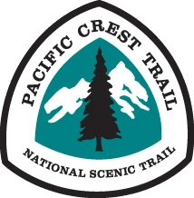

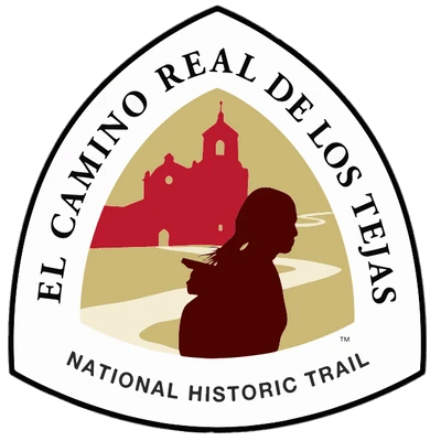
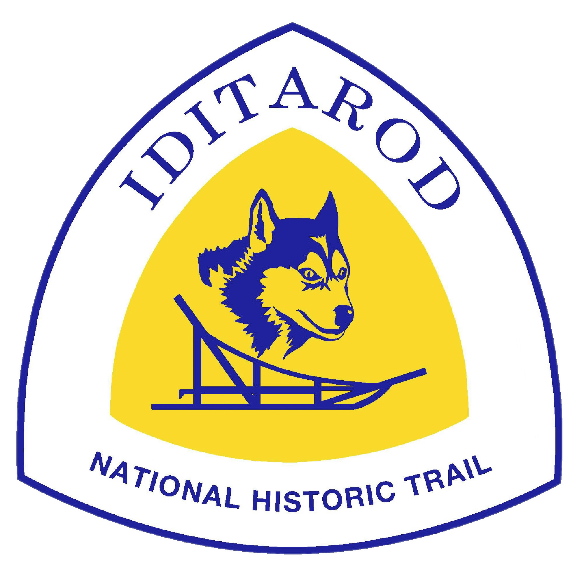
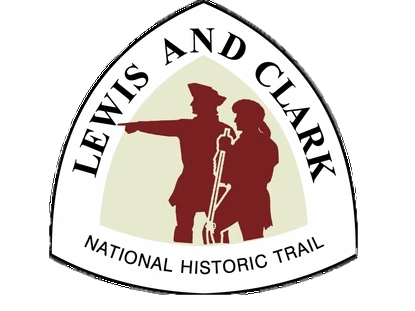
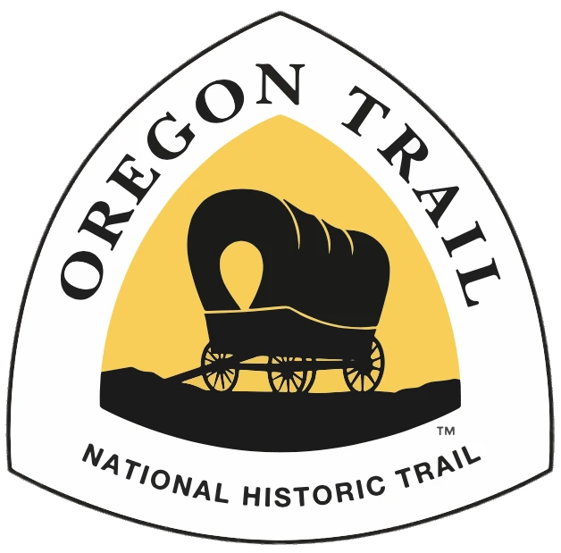

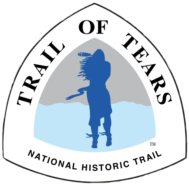
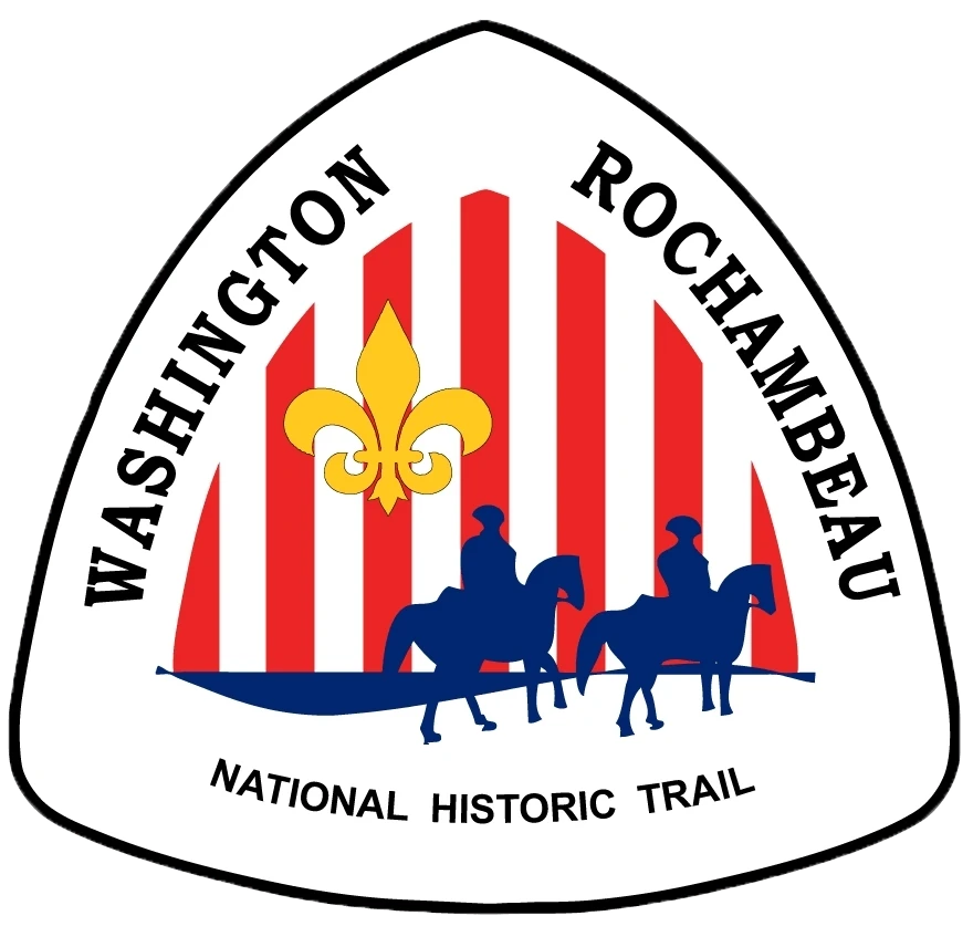
The most important point, however, is the separation of visual identity from navigation. The National Park Service itself, in the official guidance for the Potomac Heritage National Scenic Trail, states that a trail emblem should not replace blazes or other markings where directional guidance is needed. This does not prevent logos from appearing on signs and markers, but recognises that identifying a trail and showing the way are two different functions.
It is precisely this distinction that I find missing from the Brazilian approach. While Americans can use elaborate emblems without making all their trail marking depend on them, Brazil incorporated regional identity into the marks painted on the ground. The result is a system in which graphic creativity imposes unnecessary difficulties on navigation and maintenance.
The hidden cost of complexity
The difference between these systems becomes especially apparent during application. A simple stripe or rectangle can be painted quickly with a brush, without internal illustrations or elaborate templates. A customised footprint, by contrast, requires a specific stencil, careful positioning and precise application to preserve its details.
In some circumstances, the job can involve as many as three people to produce a single mark: one holding the stencil, another applying the paint and a third helping to secure and position it. This does not necessarily describe every team, but it illustrates the effort a complex symbol may require. Now imagine repeating that procedure hundreds or thousands of times along a trail, then returning years later for maintenance.
There is also the question of durability. Some of these marks are applied with spray paint, whose resistance depends on its formulation, the surface and environmental conditions. There are reports from hikers who walked trails around Brasília and found markings already badly faded the following year. These reports need to be documented and do not justify generalising the problem to the whole network, but they reinforce the need to assess the service life of the materials being used.
Brazil is continental in scale, with different biomes, long rainy periods, intense sun exposure and major maintenance challenges. In a system that relies heavily on volunteers, every additional minute spent painting adds up to more work. Effectiveness cannot be judged only by the appearance of a freshly applied mark, but also by the time and cost required to keep it legible for years.
The best trail marking in the world?
Another questionable point in the article published by the Brazilian Trails Network is the claim that Brazil's trail marking is “probably the best in the world”. This is a bold assertion, especially without comparative studies of effectiveness, legibility, durability, productivity and maintenance costs. Institutional recognition and praise have value, but they are not substitutes for technical indicators.
How long does it take to paint a customised footprint compared with a simple stripe? Which remains legible longer? How many kilometres can a team mark in a day? How much does each system cost to maintain after five or ten years? And, above all, which delivers better wayfinding results in the field?
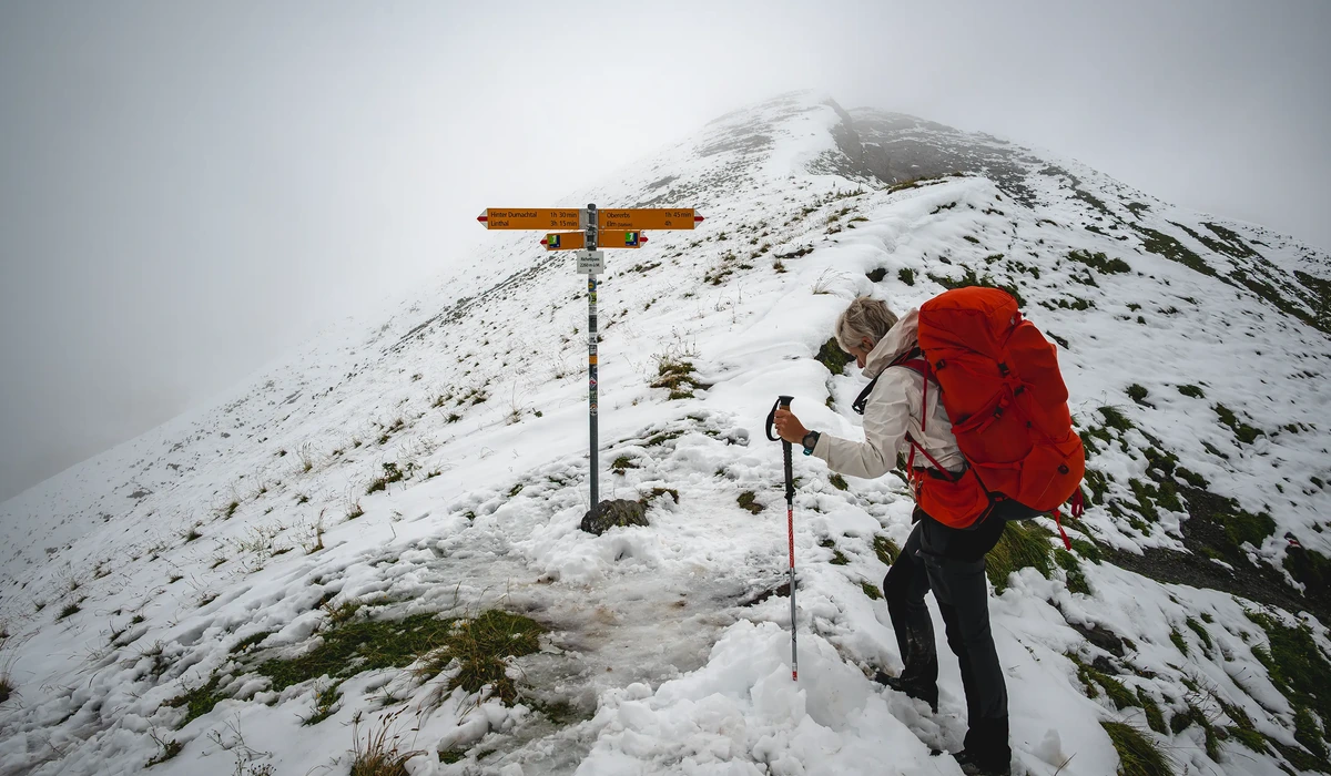
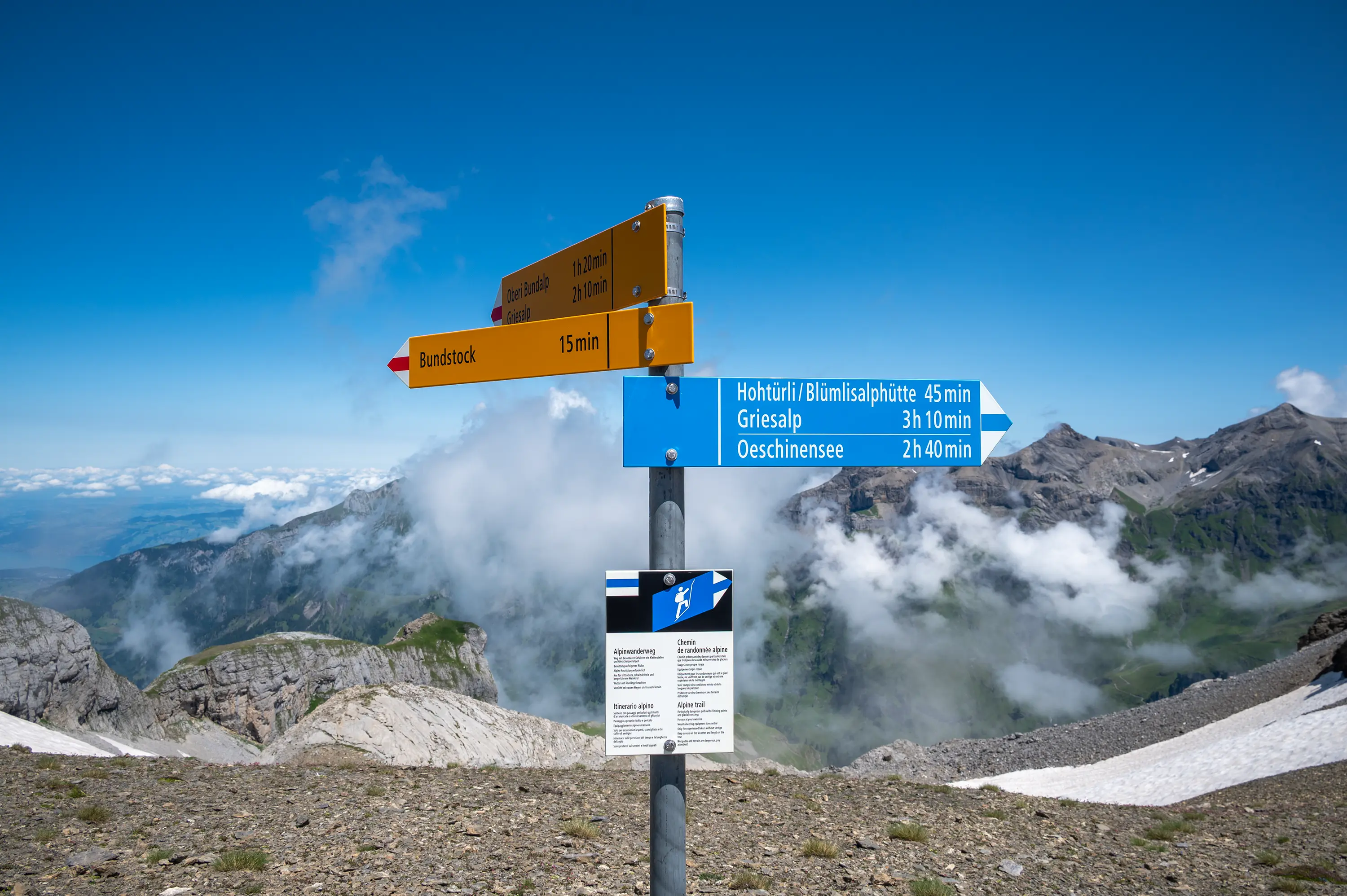
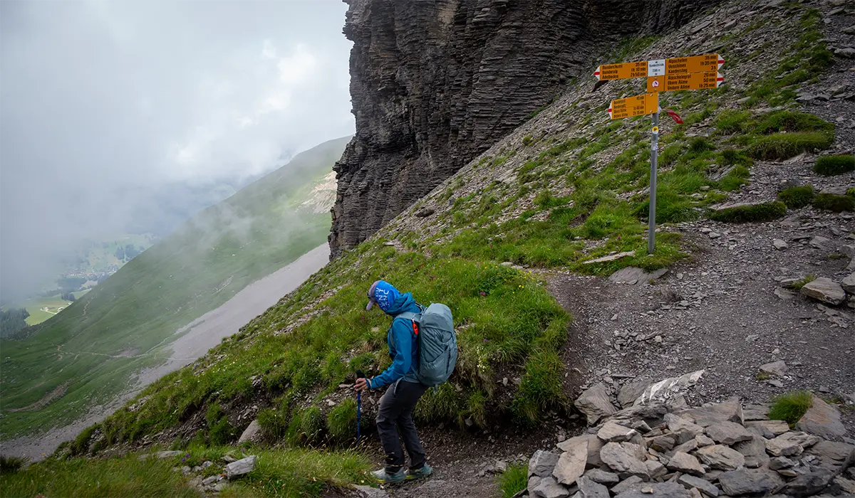
You do not need to hike all 390 kilometres of the Via Alpina or 440 kilometres of the Kungsleden to see the difference. Just one day on either trail is enough to understand how much further Brazil still has to go. In Switzerland, the traditional white-red-white stripes are easy to spot on rocks and trees, complemented by standardised directional signs mounted on metal posts. In Sweden, red marks guide hikers for hundreds of kilometres, following standards for colour, placement and visibility. These systems demonstrate planning, simplicity and attention to maintenance.

On my hikes, I observed thick layers of paint that appeared highly resistant to the weather. These are marks that give the impression of having been made to remain legible for years, withstanding rain, snow, sun and major temperature fluctuations. In Switzerland, the quality of the metal signs and their supports is also striking. It is not simply about pointing in a direction, but about building a durable system whose maintenance can be planned for the long term.
And I am talking only about trail marking. If we broaden the comparison to trail infrastructure, the gap becomes even greater. The Kungsleden, located in a remote subarctic region, has metal bridges, suspension bridges, mountain cabins, emergency shelters and rowing boats provided free of charge at certain points to cross rivers and lakes. It also has kilometre after kilometre of raised wooden boardwalks, known in Sweden as spänger, crossing marshes and waterlogged ground. These extensive structures, built with planks, crosspieces and supports, ease passage and protect vegetation from trampling. All of this requires planning, transport of materials, installation and regular maintenance in one of northern Europe's most remote regions. And we are talking about just one trail, stretching approximately 440 kilometres across Sweden.
This does not mean that Swiss and Swedish systems are perfect or require no maintenance. It means that they embody decades of experience, investment and refinement, with solutions designed to work in extremely demanding natural conditions. Before describing Brazil's trail marking as one of the world's best, comparable results would need to be demonstrated with data.
Without evidence-based answers to these questions, the superiority of the Brazilian system remains an opinion, not a technical conclusion.

Trail markers should show the way, not sell the trail
The Brazilian Trails Network deserves recognition for bringing together volunteers, managers and institutions around a national trail network. This work matters and helps broaden access to trails across the country. But recognising its achievements does not mean accepting every decision made during its development.
I believe Brazil reversed a fundamental priority by allowing goals of belonging and commercialisation to influence the choice of the symbol used on the ground. A tourism brand can be elaborate, regionally distinctive and commercially appealing. A directional marker must first and foremost be simple, immediately recognisable, durable and easy to maintain.
The country does not need to discard the visual identity built over recent years. It needs to recognise that a trail's logo and the waymarks guiding its hikers do not need to be the same thing. International examples show that regional identity can be preserved without turning every mark painted in nature into an advertising device.
After so many years hiking trails around the world, I remain convinced that the best trail marking is the kind that does its job without drawing attention to itself. It appears when we need it, confirms the right direction and then disappears back into the landscape.
The world's best trail marking is not the one that sells the most T-shirts or appears in the most photographs. It is the one that lets you hike an entire trail safely without having to ask which way to go.
Sources and references
Brazilian Trails Network: Pedro da Cunha e Menezes and José Carlos Sícole Seoane. Published April 16, 2021.
Brazilian Trails Network (YouTube). Pedro da Cunha e Menezes explains the origins of the Brazilian waymarking system and the criteria behind its design.
National Park Service (United States). Official guidance on visual identity, emblems and directional trail marking.
National Trails System Act of 1968. US federal legislation establishing the framework for the national trails system.